Tag Archives: analytics

What analytics really say about when to go for a two point conversion in an NFL game

The two point conversion has become more popular in National Football League (NFL) games, and it has become a popular topic of conversation in the NFL playoffs leading up to the Super Bowl. I once wrote a blog post that uses dynamic programming to identify when to go for 2 based on the score differential and the number of possessions remaining in the game. The analysis also shows what difference the choice makes, noting that most of the time the win probability does not make a huge difference in the outcome of the game, affecting the win probability by less than one-percent in most cases. In this post, I delve into the two point conversion, covering rule changes, football strategy, and assumptions.

By the numbers

In 2023, a typical NFL team attempted a two-point conversion about once 1 every 4 games and was successful just over half the time. A decade ago, a typical team attempted a two-point conversion about once 1 every 8 games and was successful just under half the time. Two point conversions became more popular and more successful. Two rule changes influenced these changes:

  1. In 2015, the NFL moved the extra point attempt from the 2 yard line to the 15 yard line.
    • The proportion of extra points that succeeded lowered from 0.996 (in 2015) to 0.941 in the seasons after the change. A chart in an article on Axios illustrates how dramatic this change has been on extra point success rates.
  2. In 2023, a new rule allowed offenses to attempt a two point conversion from the 1 yard line (instead of the 2 yard line) when there was a defensive penalty on a touchdown.
    • The proportion of two point conversions that succeeded increased from about 0.5 to 0.565, the first season the success rate was well-above 0.5.

The difference of one yard makes a difference. For comparison, attempts to go for it on fourth down and two yards to go succeed 57.2% of the time, and this increases to 65.5% for fourth down and one yard to go.

Decision-making

After a team scores a touchdown, they have essentially two choices. They can kick an extra point or they can attempt a two point conversion. The proportion of extra point attempts that were successful in 2023 was 0.96, and historically the proportion of two-point conversions that have been successful is 0.48. Therefore, on average, the extra point attempt or two-point conversion have promised roughly the same number of points on average.

The goal is not to maximize expected points, it’s to win the game. The two rule changes above have tipped decision-making in favor of the two point conversion in more situations by making the extra point attempt less attractive and the two point conversion more attractive.

The “best” choice for improving the chance of winning is situational and depends on a few factors:

  • Point differential
  • Time remaining (including time outs remaining)
  • Strategies that each team may employ in the resulting situations
  • Specific teams and match-ups

The dynamic programming model takes the first two factors into account, where the time remaining is modeled as the number of possessions remaining. Dynamic programming is an algorithmic approach that essentially enumerates the possible outcomes of the remaining drives in the game to quantitively determine the best options for the average team. This approach does not take specific situations into consideration, however, it is informative as a baseline.

Using 2023 data, I present a chart of when the average team should attempt a two-point conversion based on the 2023 data. In this chart, pictured below, the rows capture the point differential when a touchdown is scored, with a negative score capturing how many points a team is behind. The columns capture how many possessions are remaining in the game, including the current possession. Therefore, as the game evolves, we move left in the table. The team with the final possession of the game has 1 possession remaining in the table, and a team with two possessions left will not get the ball back. Note that there are 22.2 total possessions per game, on average, so the last 6 possessions or so capture the fourth quarter.
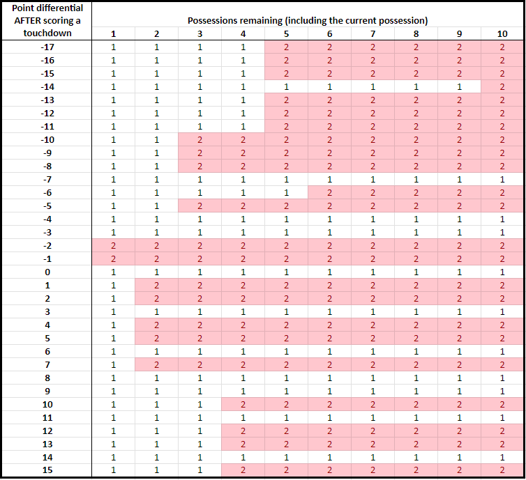
Table 1: when an average team should choose to go for a two point conversion after scoring a touchdown based on the score differential and number of remaining possessions [2023 data]

According to this chart, an average team should attempt a two point conversion in many situations, including when a touchdown in the fourth quarter puts the team down by 8, 5, 2, or 1 or up by 1, 2, 4, 5, and 7. A team should not go for two when a touchdown puts the team down by 4 or 3, puts the team up by 3 or 6, or ties the game.

Compared to 2014–before the two rule changes mentioned above–two point conversations are now the better choice in more situations. For example, a two point conversation now is the better choice for the average team when a touchdown in the fourth quarter puts the team down by 1.

My analysis, as Prof. Ben Recht notes in an outstanding post on two point conversions, makes a number of assumptions. While some assumptions are more reasonable than others, the model still offers important insights that are not obvious before crunching the numbers.

A better way to decide whether to attempt a two point conversion

When I listen to broadcasts, I get frustrated with the analytics discourse from the commentators, which is often some version of “The analytics tell you to go for 2 in this situation.”

This is wrong. Analytics do not tell people what to do. Analytics are a collection of tools that can inform decision-making, with people making the final decisions.

If I were a football coach, I would not use the chart above. I would ask for a different chart based on the same analysis. Below, I create this chart.

No team is the average team. As noted earlier, the analysis using dynamic programming makes some assumptions that are not totally valid, including that an average team is facing an average team. The chart above always gives the same answer for the same point differential and possessions remaining, and it does not reflect other attributes of the situation at hand.

One specific situation that may affect the decision is the play that a team has available for the two point conversion. For example, historically 43.4% of pass plays have succeeded, whereas 61.7% of run plays have succeeded. Having a play in mind–and its associated likelihood of success–should affect the decision. Another situation is the team’s opponent, including their run and pass defense.

There are two ways to make the dynamic programming more informative for specific situations:

  1. Change the inputs to reflect the current match-up. In this case, one could change the probability that a two point conversion would be successful, the probability that an extra point is successful, the probability that a drive ends in a touchdown, and the probability that a drive ends in a field goal.
  2. Instead of only reporting the best decision (go for 1 or go for 2), the analysis can be used to report the probability that a two point conversion should be successful for it to be the better choice than attempting an extra point. In this case, a decision-maker (a football coach) can estimate how likely their play would success against the team they are playing in the specific situation they are facing.

I illustrate the second approach below using the dynamic programming analysis above. Instead of reported the binary decision of going for 1 or 2 as before, I report the two point conversion probability of success above which going for two is the better decision. Again, I use data based on average teams. The lower the probability in the chart, the more attractive the two point conversion is.

Some decisions are clear cut. A 0.00 indicates that a team should always go for a two point conversion, and a 0.95 indicates that a team should essentially always attempt the extra point. Most of the probabilities are in between, which means that the “best” decision is not clear cut in most cases.
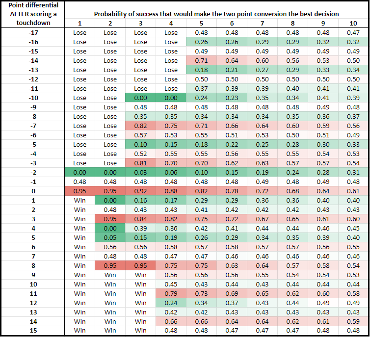
Table 2: the minimum probability of success associated with a two point conversion above which going for 2 is the better decision based on the score differential and number of remaining possessions. Situations that always result in a loss or a win are labeled “Lose” and “Win,” respectively [2023 data]

This new chart is more nuanced than the first chart in this post.

  • Sometimes it is obvious to go for 2. A two point conversion is the better decision with a play that has a mere 25% probability of success when a touchdown in the fourth quarter puts the team down by 10, 5, or 2, or up by 1 or 5.
  • Sometimes it is obvious to attempt an extra point. Going for two is the better decision with a play with a very high, 75% probability of success, which occurs when a touchdown puts a team down 7 or 3, up 3 or 8, or ties the game. Very few plays can expect a 75% probability of success, so in these situations it almost always is better to attempt the extra point.

Now consider strategies for two different teams:

  • Team A with a two point conversion play with a 40% probability of success, and
  • Team B with a two point conversion play with a 60% probability of success.

Team A and Team B would make different decisions if a touchdown in the fourth quarter puts them down by 9, 6, 4 or up by 3, 6, or 7.

Another insight: Both Team A and Team B should both attempt a two point conversion if a touchdown puts them down by 8.

Therefore, the same chart yields different “best” solutions for different teams based on the situations at hand. This insight follows directly from the numbers and the modeling, however, it is almost always overlooked in discussions on football analytics.

Related articles and posts:


data science isn’t just data wrangling and data analysis: on understanding your data

I have often heard rules of thumb, such as data science/analytics is 80% data cleaning/wrangling and 20% data analysis. I’ve seen various versions of this rule of thumb that all have two elements in common:

1) They assign various percentages of time to data cleaning and analysis, with the time allocated to cleaning greatly outweighing the time allocated to analysis.

2) Time is always partitioned into these two categories: cleaning and analysis.

I want to introduce a third category: understanding the data. This is a critically important part of doing data science and analytics. I acknowledge that many data scientists understand their data quite well, so I am not not criticizing the entire data science community. Instead, I want to point out and discuss the rich tradition of understanding the data that we have fostered in operations research and highlight the importance of this often overlooked aspect of working with data and building data-driven models. As an applied optimization researcher, I believe that data collection, understanding the data, problem identification, and model formulation are critical aspects of research. These topics are important training topics for students in my lab. To solve a data-driven model, we need to understand the data and their limitations.

Here are a few ways I have made efforts to understand the data:

  • I have asked questions about the data to subject matter experts (who shared the data with me).
  • I have done ride-alongs and observed service providers in action to see how they collect and record data as well as how they interpret data categories.
  • I have read manuals that describe data sets.
  • Summary statistics and other analytical tools shed light on distributions and processes that produce the data.
  • Disseminating research findings often results in good questions about the data sources from audience goers, which has improved my understanding of the data.
  • I have read other papers related to my problem that describe how data are collected in other settings.

Understanding the data has helped me understand the data’s limitations and apply the data meaningfully in my research:

  • Data sets often have censored data. What is not included in the data set may be critically important. There is no way to know what is not in a data set unless I understand how it was collected.
  • Some data points are nonsensical or misrecorded (e.g., 8 hour ambulance service times). Others are outliers and are important to include in an analysis. Understanding how the data were recorded help to ensure that the data are used in a meaningful way in the application at hand.
  • Some data points are recorded automatically and others are recorded manually. Both kinds can be high quality or low quality, depending on the setting, employee training, and the tool for automatic collection.
  • Understanding the data is a first line of defense when it comes to data and algorithm bias. Most data sets are biased in that they are not fully representative of the target population or problem, and understanding these biases can help prevent building models that are discriminatory and/or not effective when it comes to the problem at hand.
  • Understanding what data are not included in a data set has resulted in me asking for additional sources of data for my research. Sometimes I have been able to get better data if I ask for it.

Without understanding the data, the analysis could be a matter of garbage in, garbage out

This post covers just one of many issues required for avoiding algorithm bias in applying data science/analytics. Colleagues and I shared some of these additional thoughts with Cait Gibbons, who wrote an excellent article about algorithm bias for the Badger Herald. Read her article for more.


advanced #analytics for supporting public policy, bracketology, and beyond!

On Monday I gave a keynote talk at the tech conference WiscNet Connections (formerly known as the Future Technologies Conference) in Madison, Wisconsin.

The title of my talk was “Advanced analytics for supporting public policy, bracketology, and beyond!” I talked about advanced analytics as well as my research in aviation security, emergency response, and bracketology. My slides are below.


analytics for governance and justice

In May 2016, the Office of the President released a report entitled “Big Data: A Report on Algorithmic Systems, Opportunity, and Civil Rights” that challenges the idea that data and algorithms are objective and fair. The report outlines President Obama’s plan for identifying and remedying discrimination in data and automated decisions by making data and processes more open and transparent.

This is part of the White House’s plan for data driven governance. With better data, you can make better decisions. I love it.

President Obama said that “information maintained by the Federal Government is a national asset.” He started data.gov, which is a gateway to government agency data to researchers and the public.

Created as part of the President’s commitment to democratizing information, Data.gov makes economic, healthcare, environmental, and other government information available on a single website, allowing the public to access raw data and use it in innovative ways.

Data.gov began as a tool to reduce government waste, but it has since branched out to meet other goals, such as the aforementioned social justice issue inequities. The White House created the position “Chief Data Scientist” and hired DJ Patil to fill the position.  He has been working on breakthroughs for cancer treatment lately.  The White House hosted an “Open Data Innovation Summit” in September 2016 to share best practices regarding the opening up of government data. While I applaud the trend of open data, it is necessary but not sufficient for reducing inequities, informing decisions, and cutting government waste.

I am less familiar with the big wins that data driven governance has had. Please let me know what they are in the comments. I have no doubt that there are big wins. With better data, we can make better informed decisions.

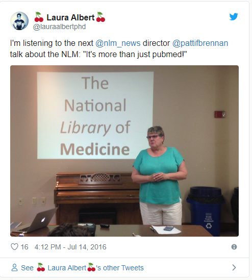
Data is a huge topic, and there is a lot of data out there. The government investing in archiving and analyzing data is necessary for breakthroughs to happen. There are a lot of people involved in this effort. My colleague, Dr. Patti Brennan now heads the National Library of Medicine. The National Library of Medicine is composed of data to support medical research, and I’m glad we have a Wisconsin ISYE Professor Emeritus and rockstar in charge.

twitter-patti1.PNG

I started this post before the election. I hope the project continues its momentum in the next administration to have an impact. Only time will tell.


Data topics at data.gov

Data topics at data.gov


tips for filling out a statistically sound bracket

Go Badgers!!

Here are a few things I do to fill out my bracket using analytics.

1. Let’s start with what not to do. I usually don’t put a whole lot of weight on a team’s record because strength of schedule matters. Likewise, I don’t put a whole lot of weight on bad ranking tools like RPI that do not do a good job of taking strength of schedule into account.

2. Instead of records, use sophisticated ranking tools. The seeding committee using some of these ranking tools to select the seeds, so the seeds themselves reflect strength of schedule and implicitly rank teams.  Here are a few ranking tools that use math modeling.

I like the LRMC (logistic regression Markov chain) method from some of my colleagues at Georgia Tech. Again: RPI bad, LRMC good.

3. Survival analysis quantifies how far each each team is likely to make it in the tournament. This doesn’t give you insight into team-to-team matchups per se, but you can think about the probability that Wisconsin making it to the Final Four reflecting an kind of average across the different teams a team might play during the tournament.

4. Look at the seeds. Only once did all four 1-seeds make the Final Four. It’s a tough road. Seeds matter a lot in the rounds of 64 and 32, not so much after that point. There will be upsets. Some seed match ups produce more upsets than others. The 7-10 and 5-12 match ups are usually good to keep an eye on.

4. Don’t ignore preseason rankings. The preseason rankings are educated guesses on who the best teams are before any games have been played. It may seem silly to consider preseason rankings at the end of the season after all games have been played (when we have much better information!) but the preseason rankings seem to reflect some of the intangibles that predict success in the tournament (a team’s raw talent or athleticism).

6.Math models are very useful, but they have their limits. Math models implicitly assume that the past is good for predicting the future. This is not usually a good assumption when a team has had any major changes, like injuries or suspensions. You can check out crowdsourcing data (who picked who in a matchup), expert opinion, and things like injury reports to make the final decision.

For more reading:


eradicating polio through vaccination and with analytics

The most recent issue of Interfaces (Jan-Feb 2015, 45(1)) has an article about eradicating polio published by Kimberly M. Thompson, Radboud J. Duintjer Tebbens, Mark A. Pallansch, Steven G.F. Wassilak, and Stephen L. Cochi from Kid Risk, Inc., and the U.S. Centers for Disease Control and Prevention (CDC). This paper develops and applies a few analytics models to inform policy questions regarding the eradication of polioviruses (polio) [Link to paper].

The article is timely given that vaccination is in the news again. At least this time, the news is fueled by outrage over GOP Presidential contenders Chris Christie and Rand Paul’s belief that parents should have the choice to vaccinate their children [example here].

Polio has essentially been eradicated in the United States, but polio has not been eradicated in the developing world. The Global Polio Eradication Initiative (GPEI) helped to reduce the number of paralytic polio cases from 350,000 in 1988 to 2,000 in 2001. This enormous reduction has mainly been achieved through vaccination. There are two types of vaccines: the live oral vaccine and the inactivated vaccine (IPV). Those who have been vaccinated have lifelong protection but can participate in polio transmission.

The paper summarizes a research collaboration that occurred over a decade and was driven by three questions asked by global policy leaders:

  • What vaccine (if any) should countries use after wild polioviruses (WPV) eradication, considering both health and economic outcomes?
  • What risks will need to be managed to achieve and maintain a world free of polio?
  • At the time of the 1988 commitment to polio eradication, most countries expected to stop polio vaccinations after WPV eradication, as had occurred for smallpox. Would world health leaders still want to do so after the successful eradication of WPVs?

The paper is written at a fairly high level, since it summarizes about a decade of research that has been published in several papers. They ended up using quite a few methodologies to answer quite a few questions, not just about routine immunization. Here is a snippet from the abstract (emphasis mine):

Over the last decade, the collaboration innovatively combined numerous operations research and management science tools, including simulation, decision and risk analysis, system dynamics, and optimization to help policy makers understand and quantify the implications of their choices. These integrated modeling efforts helped motivate faster responses to polio outbreaks, leading to a global resolution and significantly reduced response time and outbreak sizes. Insights from the models also underpinned a 192-country resolution to coordinate global cessation of the use of one of the two vaccines after wild poliovirus eradication (i.e., allowing continued use of the other vaccine as desired). Finally, the model results helped us to make the economic case for a continued commitment to polio eradication by quantifying the value of prevention and showing the health and economic outcomes associated with the alternatives. The work helped to raise the billions of dollars needed to support polio eradication.

The following figure from the paper summarizes some of the problems addressed by the research team. The problems involved everything from stockpiling vaccines, to administering vaccines for routine immunization and to containing outbreaks:

A decision tree showing the possible options for preventing and containing polio. From "Polio Eradicators Use Integrated Analytical Models to Make Better Decisions" by Kimberly M. Thompson, Radboud J. Duintjer Tebbens, Mark A. Pallansch, Steven G.F. Wassilak, Stephen L. Cochi in Interfaces

A decision tree showing the possible options for preventing and containing polio. From “Polio Eradicators Use Integrated Analytical Models to Make Better Decisions” by Kimberly M. Thompson, Radboud J. Duintjer Tebbens, Mark A. Pallansch, Steven G.F. Wassilak, Stephen L. Cochi in Interfaces

I wanted to include one of the research figures used in the paper that helped guide policy and obtain funding. The figure (see below) is pretty interesting. It shows the costs, in terms of dollars ($) and paralytic polio cases associated with two strategies over a 20 year horizon: (1) intense vaccination until eradication or (2) intense vaccination but only until it’s “cost effective” (routine immunization). The simulation results show that the cumulative costs (in dollars or lives affected) are much, much lower over a 20 year time horizon if they adopt a the vaccination until eradication strategy. This helped to make a big splash. From the paper:

In a press release related to this analysis, Dr. Tachi Yamada, then president of the Bill & Melinda Gates Foundation’s
Global Health Programs stated: “This study presents a clear case for fully and immediately funding global polio eradication, and ensuring that children everywhere, rich and poor, are protected from this devastating disease.” In 2011, Bill and Melinda Gates made polio eradication the highest priority for their foundation

polio2

In full disclosure, I’m a big fan of immunization. All of my children are fully vaccinated. My grandmother was born in 1906 and used to tell stories about relatives, so many of whom ultimately died of infectious diseases (Grandma lived until she was ~102!). I’m glad my kids don’t have to worry about getting many of these diseases. I’m also proud to contribute to herd immunity.  We come in contact with people who have compromised immune systems or could not get immunized, and I’m glad we’re playing our part in keeping everyone else healthy. Part of the reason why vaccination is challenging is because social networks play a critical role in disease transmission. Even if enough people have been vaccinated in aggregate to obtain herd immunity in theory, it may not be enough if there are hot spots of unvaccinated children who can cause outbreaks. There are hot spots in some areas in California and other states that have generous exemption policies.

Related posts:


analytics vs. operations research

Former INFORMS President Anne Robinson recently talked about operations research and analytics in a YouTube video. As President of INFORMS, she did a lot of work to promote analytics in the OR/MS community and to understand perceptions of analytics vs. operations research. I really appreciate what Anne has done for our field. Her research efforts found that people perceived operations research is a toolbox whereas analytics was perceived as an end-to-end process for data discovery, problem formulation, implementation, execution, and value delivery. This is an interesting finding.

This is Anne’s answer to the question: What is the role of OR in analytics?

“Operations research is on the top of the food chain when it comes to analytic capabilities and potential game changing results.”

I love this.

Anne’s challenge is for us to make decision-makers understand that OR is as vital and necessary as analytics. Evangelize early and often. Given the popularity of analytics, we should be able to make some inroads in educating our peers in STEM about OR, but in the long run this may be tough to do. Analytics is the new kid on the block, and it already seems to have reached widespread adoption, whereas operations research–while being at the top of the food chain–is still somewhat of a mystery to those outside of our fairly small field. Operations research has had an identity crisis for a long time, and I don’t see that coming to an end.

I applaud INFORMS decisions to “own” analytics via Analytics Certification and the Conference on Business Analytics (formerly the INFORMS Practice Conference) rather than try to solely market “operations research” to the growing analytics crowd.

What do you think?


operations research at Disney

Kristine Theiler, Vice Present of Planning and Operations Support for Walt Disney Parks & Resorts, gave a talk in the ISyE department at the University of Wisconsin-Madison when being awarded theDistinguished Achievement Award. Ms. Theiler has a BS degree in ISyE from UW-Madison.

She leads an internal consulting team that provides decision support for leadership worldwide. She gave a wonderful talk to the students about industrial engineering at Disney. Her team has more than industrial engineers and is increasingly focusing on operations research. Her team has worked on the following issues:

  • food and beverage (beer optimization!)
  • park operations: attraction performance, operation at capacity, efficiency programs
  • hotel optimization: front desk queuing, laundry facility optimization
  • project development: theme park development, new products and services, property expansion
  • operations: cleaning the rides and park, horticulture planning
  • operations research: forecasting, simulation

Ms.  Theiler showed us her “magic band” – a bracelet that links together the services that a park-goer (a guest) has purchased as well as her room key and possibly her credit card (with a security code) to optimize efficiency. Guests can choose one of seven bracelet colors. This may facilitate personalization aka Minority Report. The magic band is under production.

She also noted that guests at Disney Toyko are willing to wait longer than guests at any other Disney park. Interesting.

Disney works on four key competencies that mesh well with tools in the OR toolbox:

  1. Capacity/demand analysis
  2. Measuring the impact (guest flow, weight times, transaction times)
  3. Process design and improvement
  4. Advanced analytics

The planning for Shanghai Disneyland is underway. Some of the relevant project planning, such as where to locate the park. Once a site is selected, the IEs will plan train lines between locations; how many ticket booths, turnstyles, and strollers will be needed; how to select the mix of attractions and lay them out; how many tables and chairs are needed; what is the right mix of indoor and outdoor tables; how much merchandise space to set aside; how to route parades; how to handles the “dumps” that happen when a show lets out; how to locate your favorite Disney characters (played by actors) for photo ops; how to plan backstage areas to coordinate complex shows; and locate and run hotel services.

Training scheduling optimization for the cruise lines was one of the more technical projects. There are many side constraints and stochastic issues for the 1500 people that may need to be trained at any given time. There include precedence constants (fire class 1 must be taken before fire class 2), time windows (fire drills can only be run on Tuesdays from 9-11), attendance randomness (employees and class leaders get sick), so contingency plans are a must.

Operations research and industrial engineering are obviously valuable at Disney. One of the main benefits of using advanced analytical methods is that they bring an unbiased perspective. It’s much easier to bring up a difficult issue when you discuss it from a numbers perspective rather than first stating your opinions. Analytics also provides a way to “connect the dots” between services: more people attending a show may lead to an increased need for merchandise space near the show’s exits.

Shanghai Disney


higher ed meets analytics

The Wall Street Journal reports that legislation will be introduced to identify which universities provide the most bang for the buck in terms of students’ employment prospects.  See more here. With college tuition debt surpassing 1 trillion dollars and unemployment levels being relatively high after graduation, this is a serious issue. It’s alarming to know that employment information is not generally available to prospective students when they select a university.

There are three serious challenges in identifying “valuable” universities or programs:

1. Identification of meaningful metrics.

2. Data collection and analysis to support the metrics in 1.

3. Convey what is learned to prospective students

I’m not going to critically directly discuss metrics #1 in this post, but it’s a serious issue. After all, bad rubrics can lead to an explosion in the majors that score well in those rubrics whether it’s justified or not. Let’s assume that we can agree on some basic metrics, e.g., student loan default rates.

Instead, I’ll discuss the challenges in data collection and communication, since these are core analytics problems.  No progress can be made toward recognizing valuable universities and degree programs without analytics. How should a university collect data, analyze the data, and report the results to prospective students.

Data collection is a problem for most universities – the students who report back salary information are usually those who have jobs. It’s almost impossible to infer what unemployment rates are. Some states, including my present home state of Virginia [Link], are collecting information about students on a large-scale so missing data will not be such a big problem. But there is still room for improvement:

Last year, Virginia lawmakers began requiring the State Council of Higher Education for Virginia to produce annual reports on the wages of college graduates 18 months and five years after they receive their degrees. Beginning this year, the reports must also include average student loan debt.

The state data have shortcomings. Paychecks for the same job can vary widely by location. Salary data don’t reflect self-employed graduates or those who work for the U.S. government or move to another state.

More analytics questions: How should data be analyzed regarding graduates who have gone on to graduate school? Students who are self-employed? What if many graduates go on to live in a city with a high cost of living and are paid more than there peers who live in more affordable places?

Employment rates are a function of major as well as university (as well as other factors, of course). Assessing by major and university introduces new challenges. Small programs–like entomology and maybe operations research programs–are going to be hard to assess. They will likely be sensitive to outliers that can skew expected values and missing data. We may not be able to say a whole lot about entomology majors at a university due to too few data points. Can we infer whether this major is a good investment based on other factors?

All of the tools I looked at for evaluating universities reported a single metric that reeked of expected values. There are few attempts to report a range or the uncertainty with the single metric. I suspect that this can be improved. Online retailers have done away with the average rating (based on 1-5 stars) with a confidence level based on the total number of reviews submitted. The confidence level is still conveyed as a single scalar value, but it’s more meaningful. How confident are we about the few entomology majors?

Another concern with a single metric is that it does not convey what has happened over time. I see room for analytics here to  recommend, say, when it’s worthwhile to consider law school again after there has been a substantial decline in law school admissions [Link]. This is a big issue since loan default rates (one possible metric) has gone up everywhere over the last few years but at different rates (see this college – default rates increased from 10% to 20% in three years. Others are less troubling). Trends over time are important.

In terms of conveying information, this is hard to do at a university-wide level. Having said that, I like the chart below of public 4-year universities in Illinois. Having grown up in Illinois and knowing quite about about the public universities, I would personally rank the public universities there in ascending order of their student loan default rates, regardless of major.

I’m less inclined to do so in Virginia, where some metrics such as average salary can be misleading. For example, George Mason University graduates can earn quite a lot because they often get jobs in DC, where cost of living is through the roof. They are not necessarily better off than students who get jobs at, say, Virginia Tech.

Conveying information at the university level may be too coarse. I’ve checked out quite a few online tools for assessing the quality of different universities. The level of aggregation is sometimes alarming. This online tool does very coarse ratings at the state level. This is meaningless, because there are bad and good places to get a degree in every state, and they should not be aggregated. Some aggregation is necessary. This is an area where analytics can be useful: at what level should we report outcomes: at the state level, university level, college level, department level, or other (e.g., different regions or industries where graduates may get jobs).

What role do you think analytics will – or should – play in evaluating universities?

Student loan default rates in Illinois


big data and operations research

Sheldon Jacobson and Edwin Romeijn, the OR and SES/MES program directors at NSF, respectively, talked about the role of operations research in the bigger picture of scientific research at the INFORMS Computing Society Conference in Santa Fe last week. Quite often, program managers at funding agencies dole out advice on how to get funded. This is useful, but it doesn’t answer the more fundamental question of why they can only fund so many projects?

Sheldon and Edwin answered this question by noting that OR competes for scientific research dollars with every other scientific discipline. One way to both improve our funding rates and to give back to our field is to make a case for how operations research should get a bigger slice of the research funding pie.

Sheldon specifically mentioned OR’s role in “big data.” Most of us work or do research where data plays an integral role, and it seems like this is a great opportunity for our field. I’ve been thinking about the difference between “data” and “big data” in terms of operations research. Big data was a popular term in 2012 despite how there is no good definition of how “big” or diverse the data must be before the data become “big data.” NSF had a call for proposals for core techniques for big data. The call summarized how they define big data:

The phrase “big data” in this solicitation refers to large, diverse, complex, longitudinal, and/or distributed data sets generated from instruments, sensors, Internet transactions, email, video, click streams, and/or all other digital sources available today and in the future.

I like this definition of big data, since it acknowledges that the challenges do not only lie in the size of the data; complex data in multiple formats and data that changes rapidly is also included.

I ultimately decided not to write a proposal for this solicitation, but I did earmark it as something to think about for the future. This call required that the innovation needed to be on the big data side, meaning that projects that utilize big data in new applications would not be funded. Certainly, OR models and methods benefit from a data-rich environment, since it leads to new OR models and methods. Here, data is mainly used as a starting point from which to explore new areas. But this means that there is no innovation on the Big Data side. Instead, the innovation will be on the OR side. Does big data in OR mean that we will continue to do what we have been doing well, just with bigger data?

This is an open question for our field: how will bid data fundamentally change what we do in operations research? 

My previous post on whether analytics is necessarily data-driven and whether analytics includes optimization can be viewed as a step towards an answer to this question. But I’m not close to coming up with an answer to this question. Please let me know what you think.